How to use the GL Digital logo.
For press, partners and everyone writing about us: here are logo, colours and typeface, plus the few rules that keep them looking the same everywhere.
The logo comes for light, dark and one colour.










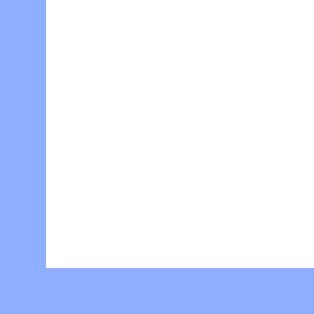

Three rules keep the logo legible.
- 01
Clear space
Keep twice the stroke width free on every side: 28/96 of the mark's height, about 12 px for a 40 px logo.
- 02
Minimum size
Logo 24 px high (print 8 mm), monogram 16 px (print 5 mm). Smaller only as the app icon.
- 03
Background
Light: the L in deep blue, G and wordmark in ink. Dark: the on-dark version. On blue: all white, one colour.
What not to do with the logo.
- Colour the L anything but blue, or the G blue and the L black.
- Close the gap between L and G, round the corners, add outlines, shadows or gradients.
- Reset the wordmark in another typeface or arrange monogram and name differently.
- Rotate or mirror the monogram. A mirrored L is not an L.
- Put the L on its own before a word. Before a name goes the whole monogram.
One colour, lots of white space.
Deep blue is the only accent colour. Roughly per surface: 70 per cent surface, 20 per cent ink, under 10 per cent blue.
- Deep blue
#1238A0bluePrimary action, links, the L. Under 10 % of the surface. - Ink
#0B0E14inkText and lines. Around 20 %. - Surface
#FFFFFFsurfaceThe page. Around 70 %. - Night blue
#08132Bsurface (dark)Dark sections, footer, campaigns. - Blue on dark
#8EAEFFblue (dark)The L and accents on night blue.
Geist for everything, Geist Mono for figures and labels.
Our name is GL Digital, with a space.
- 01
GL Digital
Not GL-Digital, GLDigital or G.L. Digital. The company is GL Digital GmbH.
- 02
Products in lower case
kl1ck is written in lower case and with the digit one. The AI Workspace has no brand name of its own.
- 03
Claim
Digital. Sovereign. In German: Digital. Souverän. Always both parts, each with its full stop, the last one in blue.
The whole monogram stands before every product name.